
Project: OCEANBREAKER
Every year, cargo ships emit enough CO2 to account for 3% of all GHG emissions. To move the millions of containers, over 500 million tonnes of fuel is consumed each year.
Apart from the emissions, cargo ships are responsible for a myriad of other pollutants; ballast water, biocides, waste, and occasional oil spills.
For a clean environment to be possible in our near future, we must develop a new generation of vessels.
Must use alternative fuel source: Lithium Ion, Hydrogen, Nuclear
Speed: Must be able to complete typical Hong Kong to Belgium or Rotterdam port in 30-35 days. Average 25 knots.
Carrying Capacity: 20,000+ TEU
Requirements

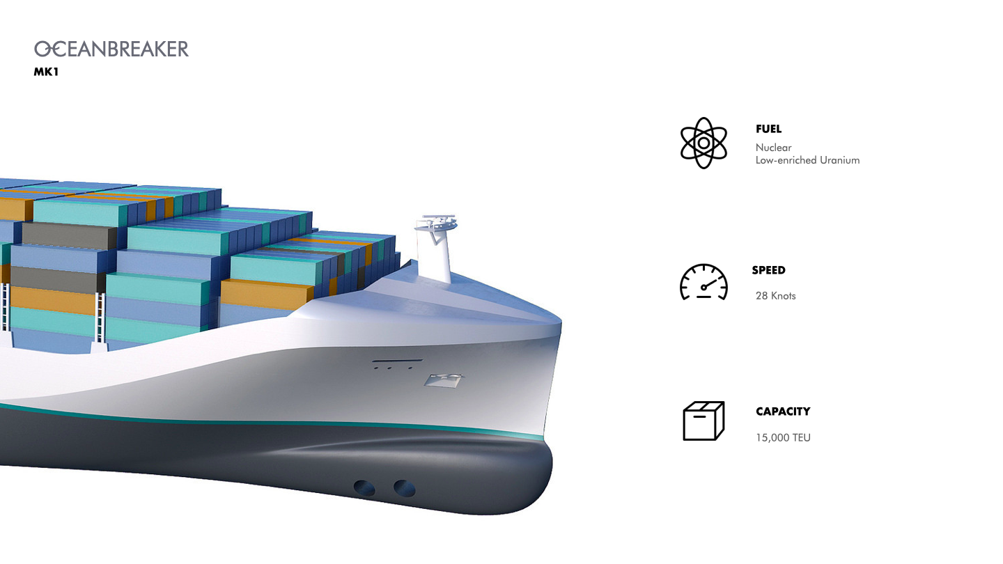
Solution: OCEANBREAKER MK1
Oceanbreaker is a new class of ULCS vessel with equipped with a S4W reactor for propulsion.
Through research, it became increasingly obvious one of the main challenges would be the storage of fuel. While lithium ion and hydrogen are both viable energy solutions, their respective fuel density would require too much room.
Using inspiration from Nimitz class nuclear ships currently in use by the US Navy, it is possible to adapt an A4W nuclear reactor for propulsion. The output delivers 194 MW to the ships four shafts – this is a 2.4X improvement on the best diesel engines used on E class Maersk ships.
The technology is already being used in today’s marine propulsion – the military as mentioned earlier use this technology not only for aircraft carriers but submarines; ice breakers also use nuclear reactors.


Among all the elements critical in battling COVID-19, data is arguably one of the most important. Here, I explored what an updated COVID dashboard may look like for the BC CDC.
COVID-19 Dashboard

Before:
When redesigning this dashboard, one of the first issues I saw was an incredible amount of space being taken up by large numbers on the left. This presented an opportunity to incorporate context into the numbers which wasn’t being produced before.
Context in this case looks at not only the number of total, new, or active cases, but the delta, or change in the range. For example, it is far more valuable to know that cases this week compared to last are increasing at 3%. Or that ICU hospitalizations are decreasing at a rate of 5% week over week. These pieces of data can inform our Province’s variable policies – dictating curfews, quarantines, as well, giving citizens perspective on what they need to do to flatten the curve.
Inspiration:
A lot of the design concept is simply marrying clean UX/UI design with the experience I had in finance, looking at financial charts. The color palette leverages a dark mode type theme with a grayscale map to accentuate hotspot focus. Change and change percentage in both numeric and graph form take on the secondary colors that are neon parallels to conventional green/red indicators found on any stock trading platform.

Usage:
The key highlight of this dashboard compared to the one currently being used by the BC CDC is that of multi-solution functionality. This simply means that looking at One area should be able to answer two or more questions.
Case data can be modified to show cases by days, weeks, or months with their respective change percentages, thereby answering the pace of infection and recovery.
Latest news provides causality to the information above: users can either see the highlights or click to read the full article.
The map can be zoomed into or out of to see hotspot locations with specific events mentioned below. Separation of cases by region shows the concentration of cases within the province.
The right side of the dashboard is reserved for data modeling: Where along the curve is the province for cases versus hospital capacity, what is the distribution of cases by age and how do we compare to our international counterparts?
I hope my COVID-19 Dashboard MK1 has attempted to answer these questions better than the current dashboard and presents the information in a manner that is easier to read and understand.
COVID-19 Sink
The corona virus has left humanity with lingering feelings of fear and anxiety. The very fabric of society has been altered in a way that will never return to what it once was.
To alleviate some of the fear and apprehension, I designed a sink which incorporates sensors, machine learning and an interactive display to show hand washers how much time remains for the optimal clean.

In the human species, physical intimacy has transcended that of biological necessity and settled on recreation, pleasure and pure indulgence.
Although the spectrum of intimacy – in the case of sex, is often blended into one; appreciating the beauty, fragility and preciousness in their respective phases was the inspiration behind this campaign.


